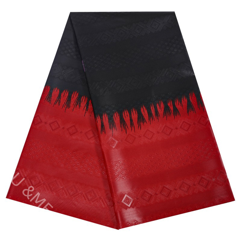
Pantone’s Fiery Red, described by the brand as “a super electric red tone that signals an energetic intensity,” is a vibrant color.

Laurie Pressman, vice president of the Pantone Institute, said, “This is a bold, bold red that is vibrant and inspires joy and optimism.”
How to match fire red?

Red is one of the three primary colors of light and one of the four psychological colors. It has a very strong impact on the vision and is a very strong color. It seems to form a strong contrast with many colors. The most shocking visual effect in the interior is the space with clear red and black. A large area of red is used to create a new home space with a great sense of design, which is more classic and advanced.

In general, red can sometimes appear strong, so it is often paired more naturally with white or other pastel colors. For example, with white, can make red look more eye-catching; Pair with gray to make red more calm; Add a soft touch of red by pairing it with lavender or bean paste green. Also, pair it with a bright color, like orange or yellow, to make red light and pleasant.
The above content is from Global Textile Network
Post time: Mar-03-2023

